A finance report will likely contain a profit and loss and cash flow statement, giving a good overview of the performance of the business in terms of profitability and cash flow. Actual figures can be compared to budgets/forecasts, meaning these reports run over multiple pages (with hundreds of individual figures).
But the sheer volume of data presented in these reports makes them difficult to read and easy to gloss over. This is why we like Bridge Charts (sometimes called "Waterfall Charts") - to get a better overview of the numbers.
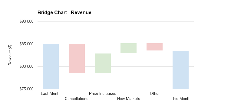
A bridge chart lets you visualise a series of events, drivers or activities to explain the difference in two points. Having a bridge chart will mean you can quickly assess the main drivers of a movement, and drill down into financial reports if necessary. Two examples are explaining a difference in revenue, and bank balances.
Bridge Chart for Revenue
The above shows that even though revenue dropped in the month, there were more significant impacts that need further analysis.
Bridge Chart for Cash Flow
The above bridge chart gives a quick overview of the cash flow activity for the period.
The charts can be created in excel or google sheets which gives flexibility as to what events or activities are presented, enabling the preparer to properly analyse performance.
If you need any help in setting these up for your business please get in touch or book a demo


